Copilot integration in windows
Copilot in WindowsSystem Tray


How I took a menu with one item and defended it into an entry point for a million Windows users.
- Duration
- 1 month
- Role
- Owner
- Users
- 1M WAU
- Status
- LIVE in Copilot

Because copilot icon in the windows system tray
only quit the app, it was proposed to be removed, until..
The Problem
Windows keeps two kinds of things in the system tray:
1. Apps running quietly in the background 2. Apps you need to reach in one click.
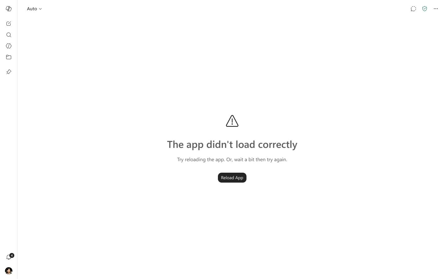
Microsoft 365 Copilot was in there but right-clicking it offered exactly one thing, and that thing was to Quit the application.
It was very difficult to justify its presence in a coveted spot like the system tray, especially as Windows was doing a cleanup of Copilot logos and entry points.
This case study is how we built a case to keep it and evolve it.
I found an insight in telemetry
The tray was never going to be the biggest entry point. The useful question was how well it converted against the alternate entry points.
Read down the volume column and the tray looks dismissible.
Read across to conversion and it stops looking that way.
The tray was not underperforming. It was underbuilt.
User Expectations
Nobody has an opinion about tray design. They have habits.
Every other icon in that strip answers at least one of three questions:
1. What is this app doing right now 2. How do I get to it 3. How do I make it stop.
Copilot answered only the last one, which is why the icon read as clutter rather than access.
We wrote the expectation down as two ranked jobs.
P0. I want to access M365 Copilot instantly from my taskbar without needing to permanently pin the app.
P1. I want to quit M365 Copilot in the background without it running in the background.
What the neighbours were doing
We audited what first-party and third-party apps actually put in their tray menus, because those menus are the convention users had already learned.
| App | What its tray menu offered |
|---|---|
| M365 Copilot (before) | Quit. |
| Outlook | Open App, Exit App. |
| Teams | Presence submenu (Available, Busy, Do not disturb, Be right back, Appear away, Appear offline, Reset status), Collect Support Files, Quit Teams. |
| ChatGPT | Copy app info, Reload, Open ChatGPT window, Quit. |
| Perplexity | Open Perplexity, Check for updates, Launch at startup, Minimize to Tray, Quit Completely. |
The apps treated the tray as a status surface first and a launcher second, and it earns the space by telling you something you did not already know.
Designing for three surfaces
Partway through, the programme changed shape. Consumer Copilot and Microsoft 365 Copilot were merging into a single Windows app, and the tray stopped being a standalone feature.
It became one of three shell surfaces that had to behave identically: the taskbar jump list, Start and Windows Search, and the tray.
This means if the app was quit to the background it needed to reflect across these three surfaces in conjunction.
Writing the code
Built out the requirement in our app codebase on a new branch. A series of checks for accessibility and localisation and then we were off to merge to our main branch.
The tray shipped in the unified Copilot app and held its numbers: 25.4% attach, roughly 250,000 chat users a week, on a base of about a million. It survived the rationalisation it had been written to defend against.
Volume is the wrong argument for a small surface.
4% of weekly actives reads as noise until conversion sits next to it.
The 25.4% attach rate is what kept the tray alive, not the million users.
Design the exit to earn the entrance.
This small intervention based on telemetry
sent 250,000 users back to chatting with Copilot